Quick questions
Which is the most important heritage of Benjamin Moore?
There are so many aspects of it! One of the most important aspects is consistent quality and a level of premium performance whether in the products we produce or the colors we offer. Looking back decades, we have been the first to make custom tinting possible to offer a wide array of colors available to our customers, likewise we were at the forefront of creating collections and even naming colors, changing the color selection process.
What is your personal favourite colour palette?
While I love an array of vibrant, saturated colors, the colors that appeal to me most are neutrals with interesting undertones, and colors that bring dimension to a space while allowing for opportunities with fabrics, furnishings, art and other materials to create cohesion and interest.
Who is your main source of inspiration?
Architects and designers who have a very classic or traditional sensibility with a twist that feels modern or celebrates unexpected details. I am a big fan of Robert AM Stern and his incredible homes from a reimagined shingle style to the gorgeous blending of traditional elements. I also love the work of Nate Berkus with his neutral colors enhanced by gorgeous materials and finishes.

Two siblings, 2,000 dollars and endless creativity. This is how it started, and today, thousands of colour shades are available on your palette. What's this if not chrystal clear success?
With over 3500 colors in our portfolio it is not often that we add a color, but when we do there are several steps in the process. We will start with a point of inspiration from our ongoing research – maybe it’s a piece of fabric or a memento picked up in our travels, including a color that offers something interesting and different. From there, we work closely with our labs to develop exactly the right prescription and balance of pigments, making it possible to bring that inspiration color to the walls of our customers.

Why is constant development important?
Our labs and research facilities are something we are very proud of, with continual advances in paint performance that keep us at the top of the industry. This steadfast focus on advancing paint technology, development of our own colorants and resins makes it possible to maintain the highest levels of quality – a true hallmark of the Benjamin Moore brand. Just like sustainability: we have a strong focus on making decisions with the future of the environment in mind, as well as compliance with health and safety regulations. All of our premium products meet or exceed industry standards with regard to VOC regulations. We have also long been committed to supporting our local communities and selling our products only through independently owned stores – they offer best-in-class expertise and service.

You put big emphasis on the psyhology of colors. How should we choose the colours that suit us?
Color selection is very personal, and we love the subjective nature of color. For one person, a color may be calming, for others it may be dramatic – but that’s where expressing our personalities and tastes through color can be a lot of fun. We always encourage people to consider colors that resonate with them in some way or use a point of inspiration that evokes a positive feeling, allowing this to be a guide when selecting colors for the home. We can make some generalizations about color linked to personality by saying things such as “bright bold colors are favored by extroverts” or “muted, softer colors are the choice of introverts”, but we would rather not create anything that sounds like a category or rule. Instead, we always encourage people to think about which colors resonate with them.

Do colors get a leading role in your home, too?
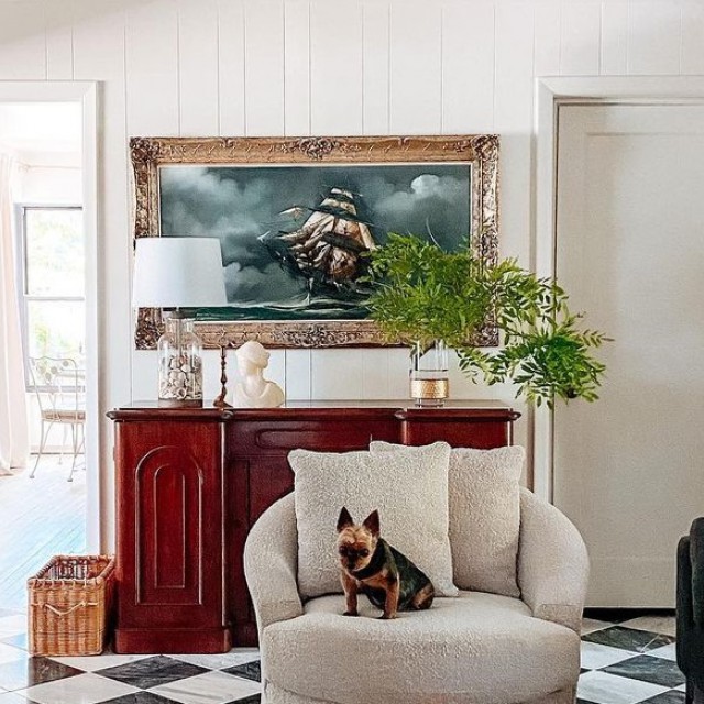
Many people ask this question assuming I have an array of bold colors in my home, but instead, I have a fairly neutral color palette that allows me to bring in other colors through fabrics, area rugs, art and accessories. Since I work with color daily, I like to have the flexibility of a neutral palette which allows me to experiment in other ways. Beyond neutrals, I’ve used navy and some blues throughout my home that I find both classic and calming, like White Heron OC-57, Edgecomb Gray HC-173, Navy Masterpiece 1652, Boothbay Gray HC-165, and Nelson Blue CW-635. I also gravitate toward classic navy blues, from the classic Hale Navy HC-154 to Stunning 826 with its slight violet cast.

Every year, we can't wait to find out which colour gets the Colour of the Year title. Why does the world need Raspberry Blush in 2023?
We felt the time was right to put a spotlight on a bold and confident color. We have been in a place of uncertainty and unrest for a few years now, and we wanted to look at color as an opportunity to bring energy and some exuberance to our homes. The process of choosing the Color of the Year takes several months of work, collecting bits of inspiration and discussing the directions we see color moving for the coming year. Much like assembling a puzzle, we bring pieces of inspiration together to develop the palette for the coming year along with a concept that helps to explain where we are going with color. This is always an exciting process because it serves as our opportunity to highlight colors that people might have missed when scrolling through our fan decks. Pantone’s Vivid Magenta and the messaging used to describe this color express a similar sentiment as with the Benjamin Moore selection of Raspberry Blush 2008-30.

Pictures: Benjamin Moore, interview: Dóra Volter-Horváth


Az Otthon egy kreatív, színes, változatos lakberendezési magazin.
Sőt, több is ennél: stílusteremtő, trenddiktáló, ízlésformáló olvasmány.
otthon.hu © 2024 – minden jog fenntartva
Stílusos otthonok Sztárlakások Kislakás Inspiráló helyiségek Étkezők és konyhák Fürdő Hálószoba Gyerekszoba Kert, növény Nappali Dekor Világítás Tárolás Bútorok Inspiráció Karácsony Megoldjuk Praktikus ötletek Háztartás Átalakítás Receptek Utazás Hírek RSS feliratkozás Játékszabályzat